
PRESENTATION DESIGN
GOVERNMENT
2025
Government Template
presentation template
presentation template
The template has a single audience: ministry staff who put their presentations together themselves. Different offices have different equipment, so people there work in different versions of PowerPoint. That’s why the same template had to be built in two formats at once.
Alongside the slides the template ships with its own set of icons and 3D elements — twelve objects in the same two-tone blue, so a department can illustrate a slide without commissioning artwork.












The template is not a deck of finished slides but a PowerPoint file set up so that it holds together while other people fill it in. What went into the master:
The PowerPoint on the government machines is old enough that a .pptx will not open at all, so the handoff includes the older .ppt alongside the current format.
Part of what you see on the sample slides is demonstration, not template: those elements are deliberately left out of the master and marked with comments, so whoever fills the deck knows what to delete.
Two accents built in as styles — dark blue bold and black bold — with live examples on the slides, so emphasis inside a paragraph looks the same in every department.
The theme palette is embedded in the file: the colour picker in PowerPoint opens on the brand swatches and their tints instead of the Office defaults.
Type sizes are set on the master itself, so a heading stays a heading and body text keeps one scale no matter who types it in.
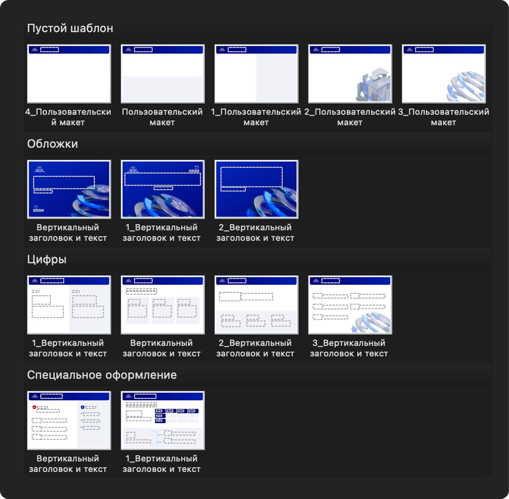
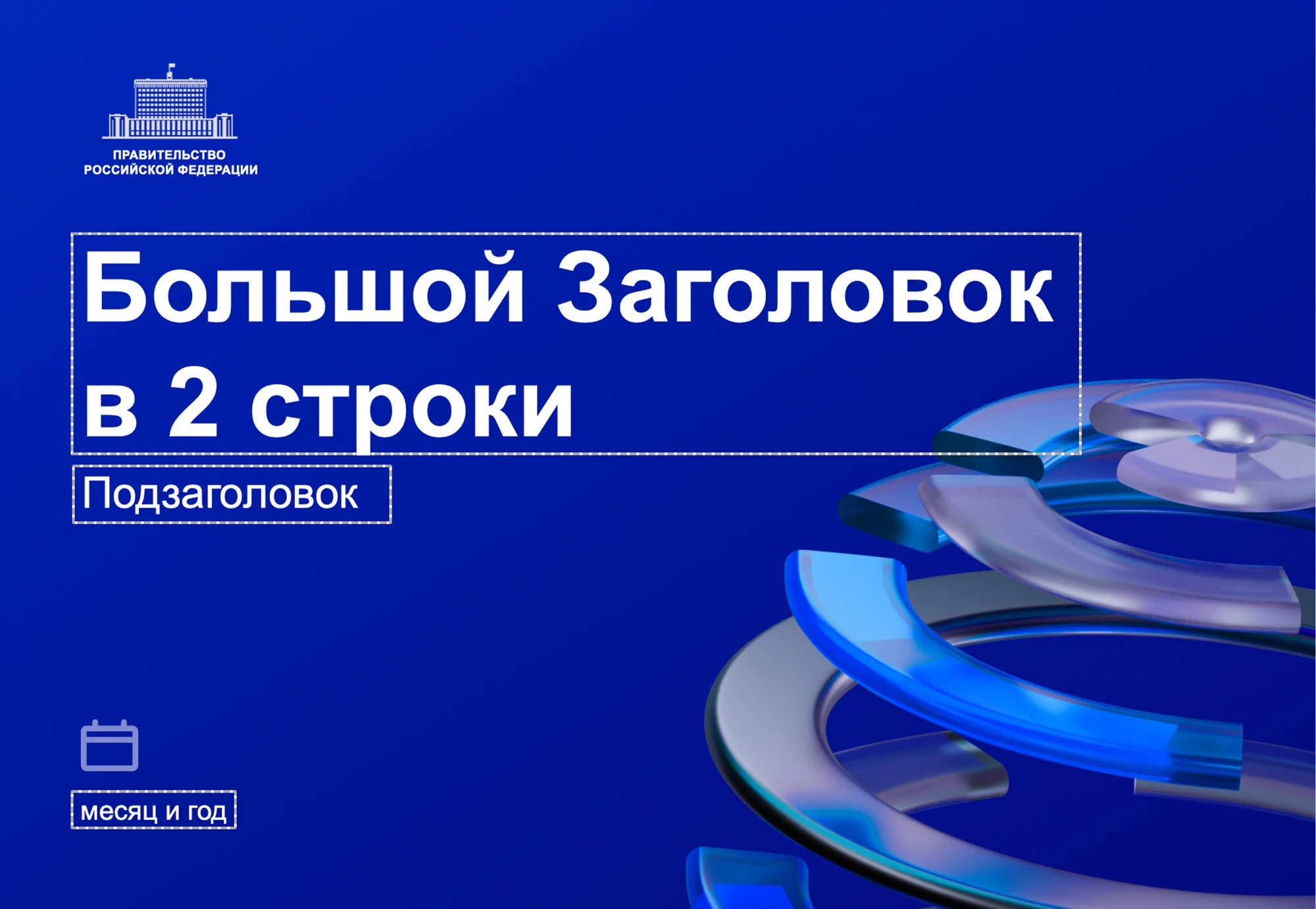
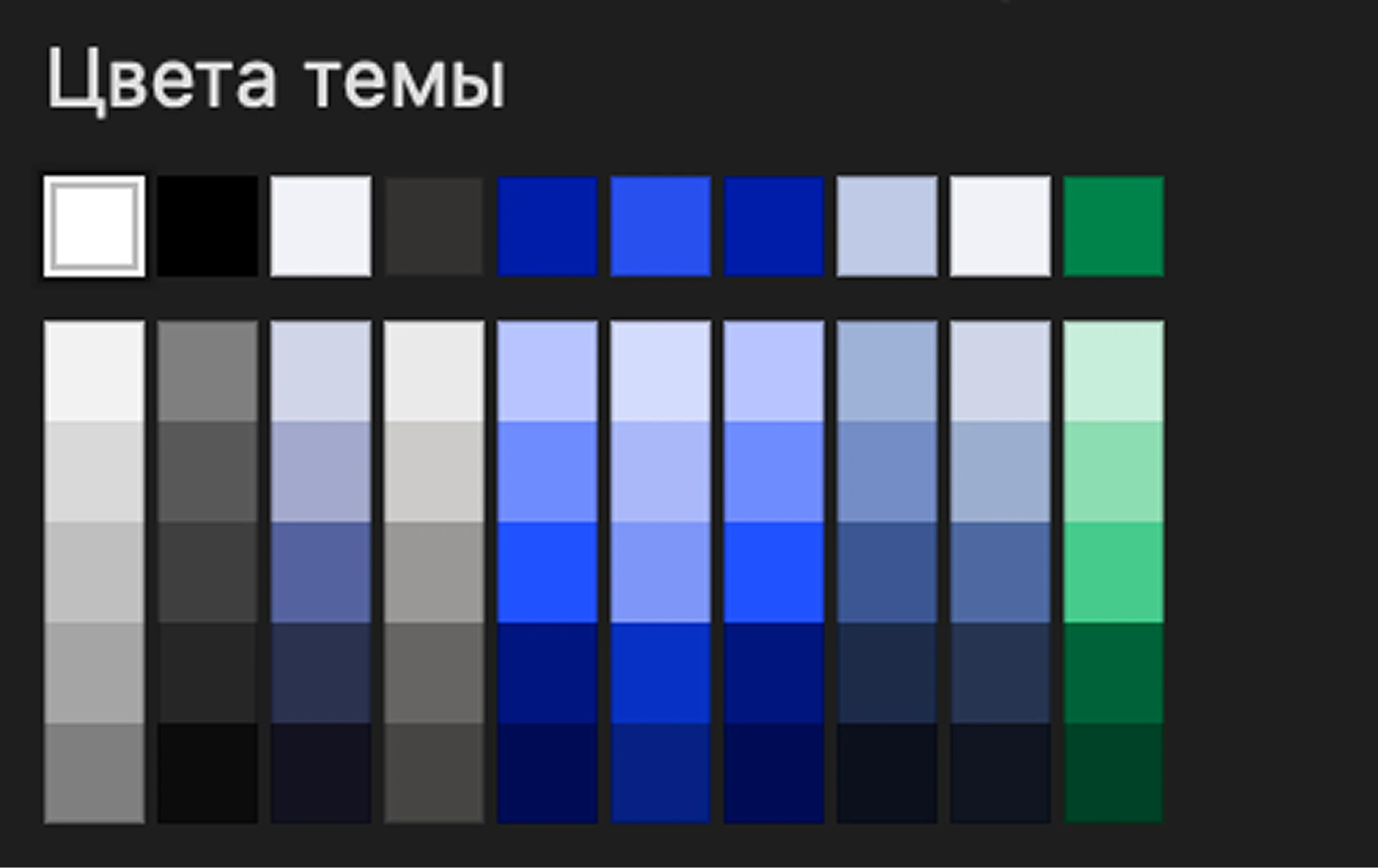
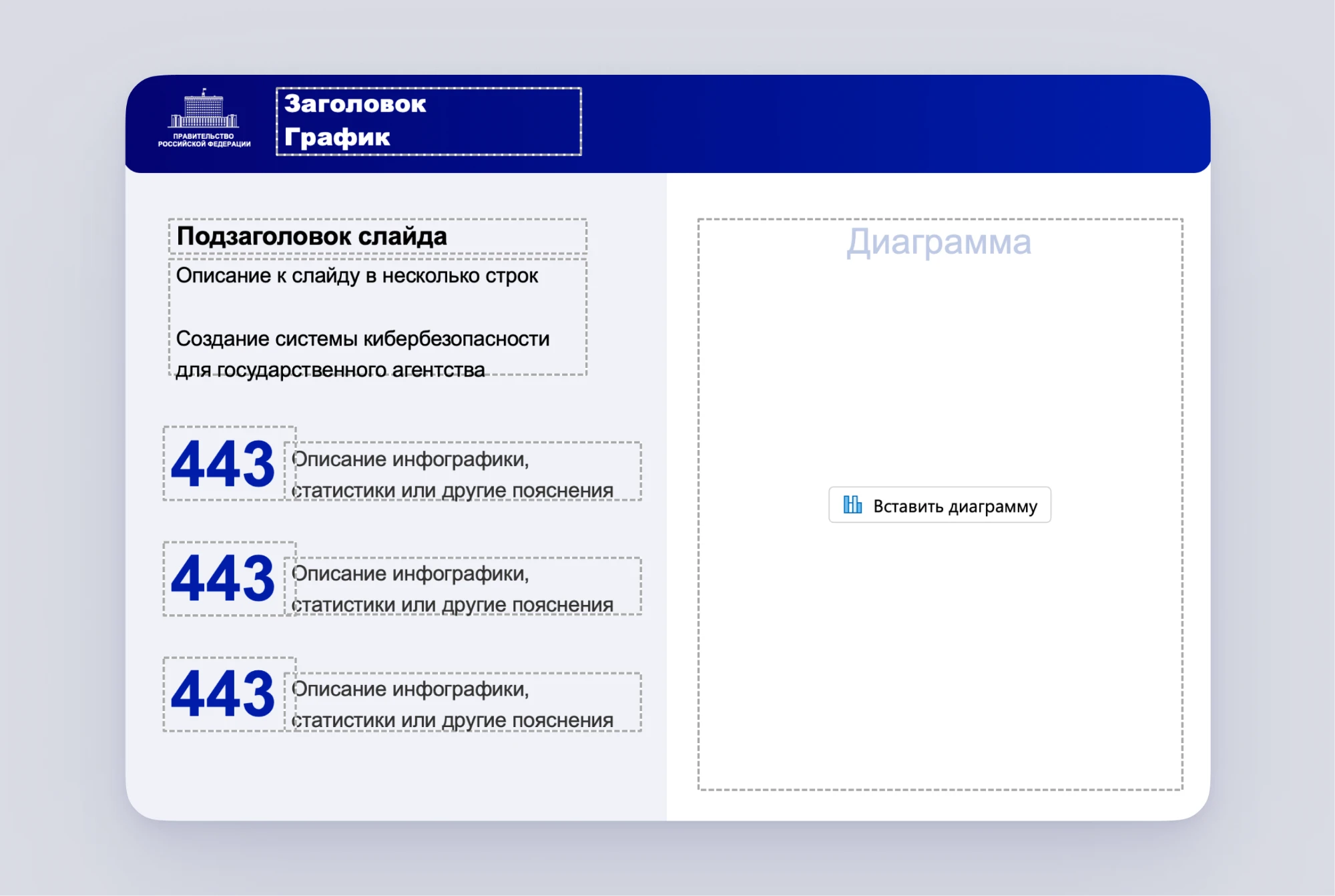
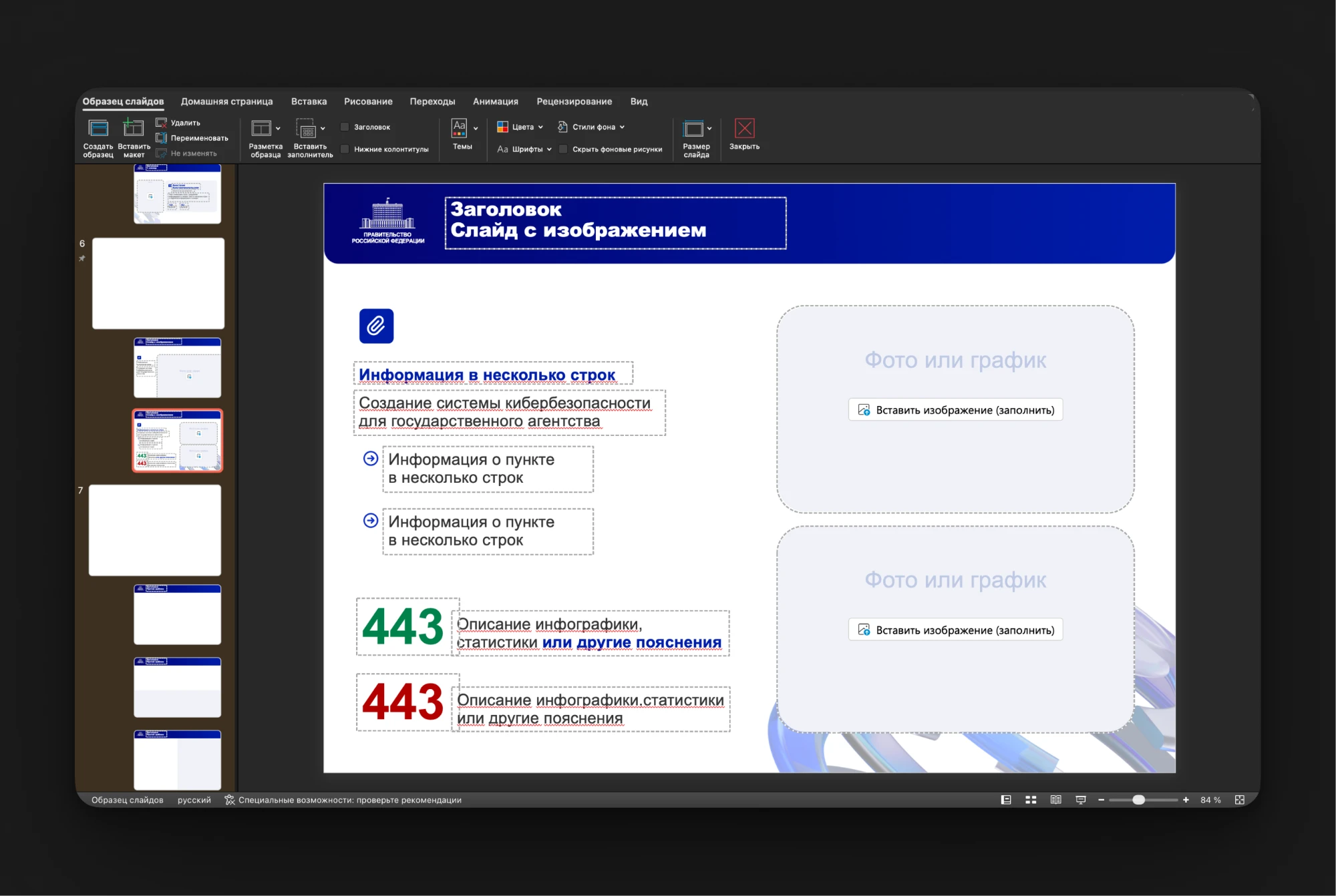
The template in PowerPoint: layouts grouped by type, the theme palette and two slides filled in as examples