01
Mark
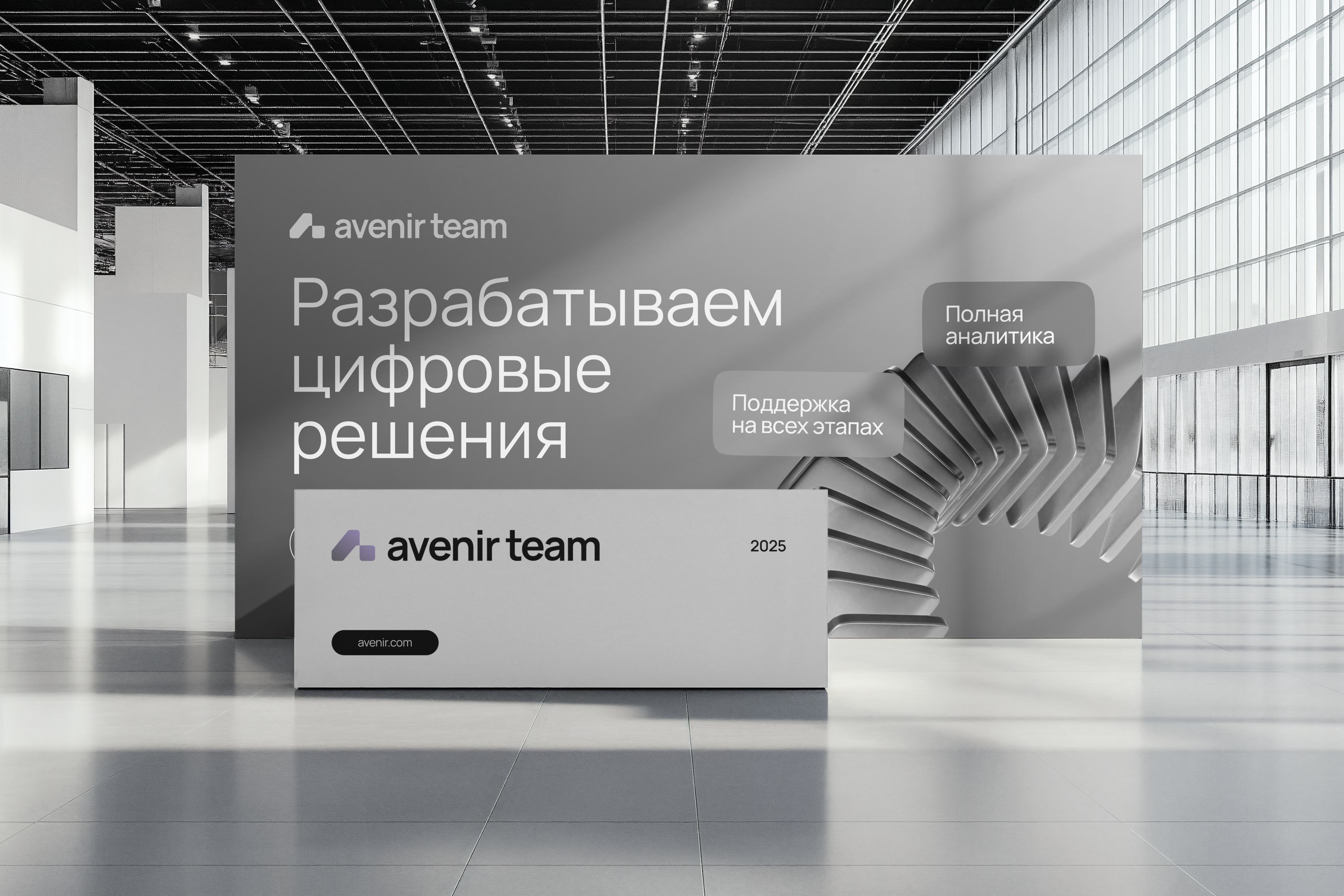
A geometric form that reads at once as the letter «А» and as
a ramp to take off from. Read the other way it is a house:
a roof and a footing. Split into two blocks it stands for a team
of many trades
02
Type
Manrope in Regular, Medium and Bold. Lowercase is the default setting — it
keeps the brand close to the reader, without extra formality. Arial stands in
where Manrope cannot be installed
03
Colour
A monochrome base — black and four greys — so nothing distracts from
the message. Light violet and violet are the accents that keep
the communication from going flat
04
Pattern
Built from the mark itself: the same plane repeated across a grid —
in a straight and in a slanted version
05
Rules
A clear space of half the logo height around the mark, and a page
of what not to do: no stretching, no recolouring, no outlines,
no shadows
06
Photography
People at work, colleagues, office details. Shots are either cut out
and combined with the pattern, or dropped into a mask shaped like
the mark